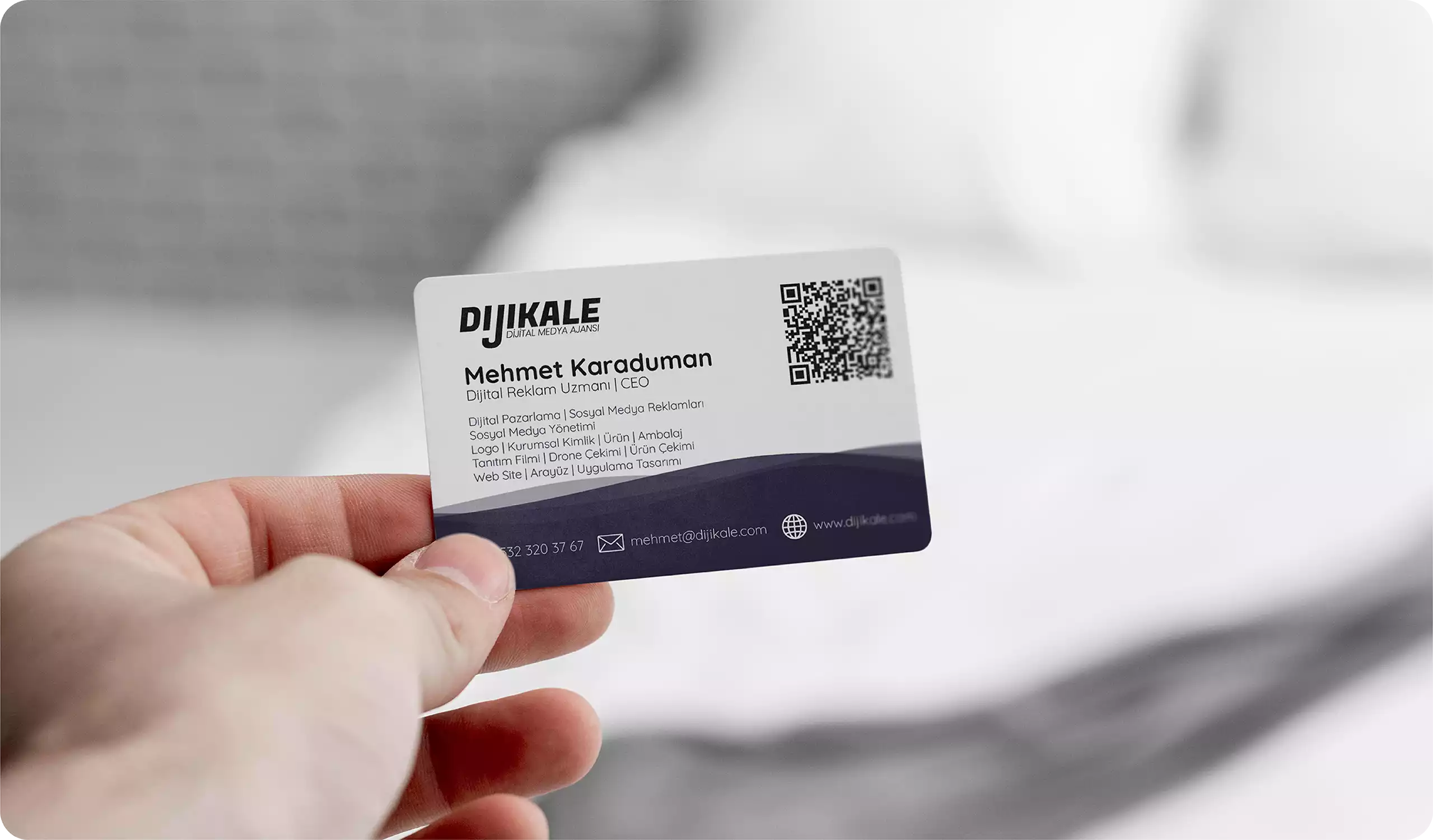
Dijikale is a company that provides services in the fields of digital marketing and web design. The name of the company is formed by the combination of the words "Dijital" (Digital) and "Kale" (Fortress). The word "Kale" conveys meanings of defense and security, reflecting the company´s aim to create and protect a reliable digital presence for its clients.
The logo of Dijikale is designed to reflect this purpose. The logo appears on a dark blue background and is designed in white. The main symbol of the logo is inspired by a fortress and features two round towers. The towers reflect the company´s goal of safeguarding the digital assets of its clients, while also symbolizing height and power in the digital world. The logo also emphasizes the company´s desire to establish itself as a trustworthy entity in the digital realm and its commitment to providing solid and reliable services to its clients.
Dijikale´s logo adopts a minimalist design approach, created using only two colors. This design approach reflects the company´s professional and reliable image, highlighting that the services offered to clients are effective and personalized.
The logo of Dijikale reflects the company´s goal of securely managing the digital assets of its clients, while also conveying the company´s vision and philosophy. The logo emphasizes the company´s philosophy of providing personalized and reliable services to clients and reflects its goal of being a lasting presence in the digital world.